Design system

This is for my portfolio, the site you're currently viewing, which includes: the design Figma file and an HTML code guideline.

Our Objectives

  • I built this design system to practice my Figma skills and gain knowledge about design systems. In addition, it also helps boost my design efficiency
  • Feel free to download these. I hope they help you.
View Figma file Download source code

Project info

  • My personal project, completed in 2024
  • Designed with Figma
  • Front-end developed using Bootstrap 5
  • Year: 2024

Design part

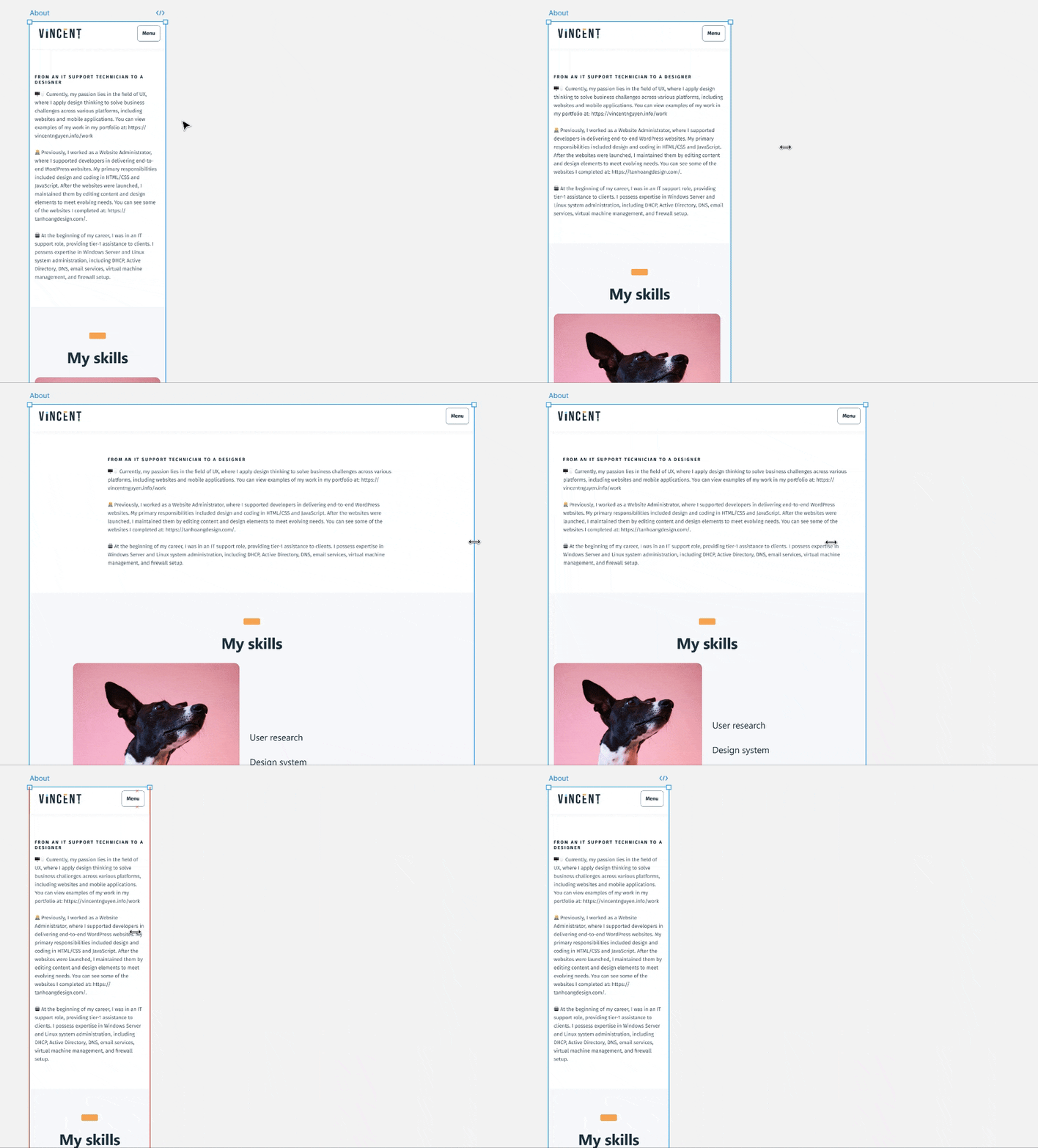
Fully responsive design

In the mobile section design in Figma, you can resize the frame to see how the site displays across different screen sizes

Grid

Since I used the Bootstrap framework, I designed based on its grid system. I created two grids: one for desktop and one for mobile.

Desktop grid with 12 columns

Desktop

12 columns | 120px margin | 32px gutters

Mobile grid with 12 columns

Mobile

4 columns | 32 margin | 16 gutters

Image ratio

When you need to maintain a consistent image perspective across all screen sizes, whether on desktop, tablet, or mobile

Ratio 16:10 - Usually use at slider, hero section
Ratio 3:4 - usually as product, mockup showcase

Color

There are three levels of color tokens:

  1. Color Tokens: Primitive colors, such as black, teal, white, etc.
  2. Theme Tokens: These inherit from color tokens and define colors for different themes, such as light, dark, and primary colors for each theme.
  3. Semantic Tokens: These inherit from theme tokens and have meaningful names, such as text, stroke, fill, background, and icons.

Colors primitive

Precede color: blue, green, purple, ...

Theme

Theme color - light or dark mode
Colors which belongs to light or dark mode

Color semantic

Color semantic - Text, stroke, Icons, Fill, ...
Colors which are meaningful: text, stroke, icons, background, ...
Color explanation
Color token tree explanation. Credit to Practical UI e-book by Adham Dannaway.

Contrast and accessibility

This ensures that your eyes won’t strain when reading. Text and other elements are easily readable without effort, following WCAG AA and WCAG AAA guidelines.

A Figma plugin assist me to check the contrast of text against background

Spacing

Spacing is about strategically creating empty space between elements in a design. Vertically, it creates harmony when the user is scrolling.

A Figma plugin assist me to check the contrast of text against background

Shadows

Shadows create depth and the illusion of space in 2D design, mimicking how objects appear under real light.

Raise

leverage level raise

Apply to higher-level layout elements such as buttons, headers, footers, and other prominent elements

Overlay

leverage level overlay

Apply to the highest-level layout elements, such as dropdown menus and frames in Figma

Typography

  • I use two fonts: Segoe UI for headings and Fira Sans for body text.
  • There are two typographic sGcales: one for mobile, which is smaller and uses less space, and another for desktop.

Border radius

The border radius of the outer frame is smaller than that of the inner frame because larger objects require a smaller radius to achieve a curved appearance.

The border radius of the outer frame is smaller than that of the inner frame because larger objects require a larger radius to achieve a curved appearance

Development part

I built the site using the Bootstrap 5 framework (HTML/CSS/JS). For animations, I used Swup.js

Change default font size

Typically, 1rem equals 16px, but I’ve reset it to 1rem = 10px for easier reference


  /* reset default rem 16px = 10px */
  html {  
    font-size: 62.5%;
  }


Re-set the font base

I set the default font size to 18px and the default gutter/margin to 32px, as per the design. By default, Bootstrap uses a font size of 16px and a gutter of 24px


  $font-size-base: 1.8rem;
  $grid-gutter-width: 3.2rem;


Create a custom of spacing

I ran a loop from 1px to 160px (from 0.1rem to 16rem) in _vars.scss and this code generates CSS. By default, Bootstrap framework only offers spacing options from 1rem to 5rem (1rem = 16px)


$spacer: 0.1rem;
$spacers: (
  0: 0,
);
@for $i from 1 through 180 {
  $spacers: map-merge(
    $spacers,
    (
      $i: (
        $i * $spacer,
      ),
    )
  );
}


As a result, the SCSS file converts to CSS classes like mt-0, mt-1, up to mt-160 and it stores in custom.css file. This allows me to apply specific margins and paddings directly in HTML.


 .mt-0 {
 margin-top: 0 !important;
 }
          
.mt-1 {
 margin-top: 0.1rem !important;
}
          
.mt-2 {
margin-top: 0.2rem !important;
}
          
.....................


Animation

I used the Swup JavaScript framework (https://swup.js.org/) to help my site transition smoothly between pages

Next project

Q-sign

A digital solution that transform the traditional signature